Random thoughts and bits of life of a coffee loving artist

Saturday, August 22, 2026

Grey Dream Project - Part 1


Apparently I have been causing a bit of a mystery among my followers for a couple of years which I find oddly entertaining in a strange way. Omitting those in my close circle who are aware of what I'm up to, I haven't said anything on social media besides certain things being 'installments of a personal project'. Welcome back my fellow adventurers so another visit to my humble corner of the world. So what have I been doing behind the scenes that it has resulted in me to keep it mostly quiet for so long? I think before I answer, I should give a bit more context.

In the Beginning

Towards the end of my time in college (circa early 2000s), I would be asked by folks if I would ever consider creating various things such as coloring books or tarot decks. Being the unsure person I was at the time, filled with self-doubt about my own skills, my response was always lightly laughing off the suggestion and pointing out that not only were my art skills not where they should be at that time but I did not have nearly any following where I could get the sales to justify such a project. The comments eventually died down but ever so often over the years, someone would ask.

First Attempt

Fast forward to 2014. My mother had suddenly passed and my anguish needed an outlet. In the past, I would channel my feelings into my work so that I could mold the anger, sadness and hurt I had brewing inside into something positive. This is when I got in contact with
a fellow creator, my dear friend and founder of UnicornWheels Stacy Garrett to try to do a collaboration project. The initial plan was to create an art book combining her photography and my traditional paintings telling the visual story of a guide traveling through dreams. We had a plan and I wrote notes for everything. Things started off well but of course the universe had other plans. Life happened. Between depression, scheduling conflicts with potential models, our combined personal obligations with our own customers, and just relearning to live, the project stalled out. After a bit of conversation, we agreed to stop and if things eventually moved into that direction again, we would give it another shot. In the meantime, anything we had created, we would have for our own personal use.

Decision Made

Through out the following years, I would still get asked if I would ever consider doing my own version of a tarot or oracle card deck. Tarot decks for me have always been very structural with little give. Oracle decks however are much more free flowing. Yes, there's a suggestion of structure and how to use them, but at the end of the day they are more flexible. The more I thought about it, the more I found myself leaning into the idea of maybe making my own oracle deck. Maybe I could do this but it would be so much work and who would even want to buy something like that? There's that self-doubt creeping in again. Let us look at the situation logically. I have friends and contacts in the Pagan and Alternative circles who would absolutely be interested. Folks who have been frequent customers over the years who would be interested. People who know someone who would be interested. But the biggest question is am I interested? Yes. Absolutely yes. By early 2021, I finally asked myself “What do you have to loose by trying?” My sanity? That was already in short supply. I am an artist, sanity was never a high requirement. After so long of doing things for other people, I saw this as an opportunity to do something for myself and if a few folks liked it enough to purchase, I would be thankful but I wasn't going to focus on it. So I put my foot down and said that this was going to happen.

Birth of a Project

So what type of Oracle deck did I decide to attempt? It took a bit of time but I realized that I could still continue on my dream inspired journey but have the cards themselves tell the visual

tale. With that thought, the start of creating the Grey Dream Oracle Deck began. At first, I created a painting that would be somewhere in the beginning of the deck's 'story' and snuck it into a collective body of work I was creating for a solo gallery showing in 2023 at Pence Gallery (Davis, CA). This was mostly to get a feel for how people out in the wild would respond to such imagery. I was already aware that dream related imagery was a hit or miss genre where it wasn't for everyone so this would give me an idea as to how people would recieve an entire body of work. Surprisingly, the feedback was overwhelming positive. With this knowledge, I went ahead and started planning and creating. Of course I needed to also work on customer commissions and handle life but there was a part of me strangely excited over the journey that I've started. 

Progress Report

Now where does this leave me currently on this little art adventure? With my current list of images on my glorious spreadsheet (that I have no idea where I would be without it), I'm approximatly at the halfway point. "What do you mean by approximatly? You have a spread sheet."  Let me explain. With my style constantly shifting and depending on if something is coming out the way I invisioned, there are a couple of the completely images that I need to return to at a later point in time to do corrections on and at least one image that I already have marked as 'need a complete redo'. After having redone two other images, I realized that if I kept redoing old work, I would never progress. So, after much deliberation, I made the decision to complete the entire list and see how things work with each other before doing any corrections. Another aspect of this project that I get to do is, once all of the images are done, write down card descriptions and meanings so that I can make sure that the finished deck can have a companion information booklet to go with it. It has certainly been an interesting learning experience so far, especially with price checking production to get an idea of initial costs, looking into what I would need for digital editing since up to this point I have been strictly traditional, and learning a couple of technicques I had never considered with my work until I tried in order to get the feel and affect I want for certain images. Are you interested in learning more about the Grey Dream Oracle Deck project? I will do my best to bring you along the journey with me so stay tuned! 


Saturday, August 15, 2026

Journey in the Dark


Cryptid Lineup
Welcome back friends! Please pardon the cobwebs and dust, life has been rather busy since your last visit. So let us start off this visit with a bit of a peek into some of the things I've been up to which also include poking at a genre of art that I never thought I would: Horror and Dark Fantasy.


Jar of Eyeballs

For the longest time, I have avoided creating any dark work. Mostly because I wasn't known to create such work and when I dabbled briefly in it during my college years, I had received a lot of concerned commentary of 'are you okay' from friends and instructors. So, to stop such questioning, I never touched it again. Yes I would do the occasional human or animal skull but I never saw it as anything horror related, rather a representation of life, death and rebirth. Fast forward to 2023-2024, I put the question out there to my current group of friends and customers if I should dip my toes back in and see what I could come up with. Instead of no or a cautious yes, I was blown away with this collective of absolute supportive loons encouraging me to go forth and test the waters. Tentatively I started off with some basic cryptids and a jar of eyeballs. I know, how tame and predictable. But as someone who had never gone farther then a pencil sketch that was quickly crushed and tossed in the recycle bin in this genre, it was a large step. It was the equivalent of opening the door and cautiously poking my head in.


Dark Yule Collection
As I felt around a bit, I realized there was another way I could get a feel for the dark and possibly spooky which was folklore and beings that seemed to only come out during the winter months. Not quite sure if they would even be considered holiday cryptids or not but I wanted to have a small collection of images that had the feel of being in a story book telling the tales of various old world holiday beings. At this point I was leaning heavily into my habit of researching cultural folklore and beliefs, finding a surprising amount of European tales that were dark and horror related. There were some tales where the beings were benevolent and kind but there was many more that were very much cautionary stories. I also found a large amount of the beings just being old women with an agenda but that is an observation for a different day. Keeping each design a simple black, white, and sepia brown for that old story book feel, I made each design able to stand on their own but work together as a collection.


Church Grim
Keeping with my random research dives into old, rarely talked about folklore, I realized that this was my best way to really experiment with this genre that I never allowed myself to tap into thanks to fear and self doubt. This is when I decided to start sinking into the pool water. What was the result? My interpretations of the Church Grim and Cu-sith. Both are part of the 'black dog' category of fables, surprisingly; protectors of their respective domains and thought to be harbingers of death to those who dare to cross them. The Church Grim was from a very old practice
used to be the spirit of the first man buried in a new graveyard to forever be tasked to act as a guard for the church. So that a soul wasn't left out of heaven, they switched to it being a black dog buried in the graveyard or as a sacrifice to hold the foundation stone. Tasked to ward off evil, to see a black dog was thought to be an ill omen. In some stories, a priest could tell if the soul of the dead would go to heaven or hell depending on how the dog reacted. Then we have the Cu-sith. Originally from Irish, Scottish and Welsh folklore, he's usually found roaming the moors and highlands. Described being the size of a small cow and having shaggy green fur (probably from moss and muck), he is usually silent save for the rare times he barks 3 times. The bark is said to be heard for miles even as far as the sea and if those who heard hadn't found safety by bark three, they would die of fright.


Cu-sith
By this time, I was finding that I was surprisingly good with creating horror/dark fantasy elements and was becoming less afraid of working in a genre that I had been avoiding touching for so long. It is a very different experience between appreciating the work that others who are more versed and known to work in it compared to actually doing something in it. What also helped was receiving encouragement and helpful tips from friends I had made within a horror community that I had wandered into earlier in the process. Many of the artists within helped me realize that I didn't have to do what everyone else did such as gore and the like, and just do something that I was comfortable with. As I continued to explore, I ended up creating little designs with the thought of 'what would someone have as macabre Victorian tassels of decoration. What came out of this strange thought process was a shrunken head, a tassel of lady fingers, and a rope of tongues. I never finalized the rope of tongues but I realized that each could be considered a play on words. The shrunken head could be for 'a small mind'. The tassel of lady fingers could be in reference of lady finger cookies or even being 'handsy'. Then there is the rope of tongues which was obviously being 'tongue tied'. I was not meaning to have such morbid jokes in this project but I honestly couldn't stop giggling the entire time I was working on them.


Victorian Tassels

Though not really horror related, I did eventually revisit the start of this entire journey with another cryptid piece. It was meant more as a cute amusing concept but spiraled into a commentary piece, showing an exchange of story telling from older folklore to newer generations. I wanted something whimsical but at the same time showing that the only reason why some old dark cautionary tales are still alive is through verbal story telling and many stories are dieing out thanks to things not being written down or discussed. Like I said, not horror related in the visual sense but more of a suggestion of horror in reference to the possibility these beings fading from the collective mind. The piece, called 'Campfire Stories' shows a young woman in traveling clothes sitting by a camfire with Baba Yaga and Mothman listening to a story from Wendigo. Sitting nearby is a Black Eyed Child looking out at the viewer instead of listening to the Wendigo talk. 


Now I know what you're probably asking: Will I continue dabbling in the horror/dark fantasy genre? I would say tentatively yes. My confidence isn't quite there but it is slowly growing. I know I would never do works akin to artists like Gerald Brom or H.R. Giger nor would I want to even attempt to. However, I am enjoying this little bit of exploration and have been discovering that I am learning skills and techniques that I can use with my current bodyof work. What will I come up with in the future in this area? Not a clue but I'm sure it's going to be an exciting learning experience at any rate. What I have been discovering during this entire journey is that it's been surprisingly theraputic. With how the world has beein the last few years and just life in general, doing these darker pieces has been a bit of an outlet for the pent up feelings that have been building up. Normally I would try to do peaceful or joyful pieces, mostly as a reminder to those look at my work that there is still good in the world but I never really had an outlet for myself. Now, thanks to this little journey into unknown lands, I have a small outlet for random thoughts and ideas that have been boxed up and put away in my mind. So I look forward to sharing more the next time I poke at this in the near future.  
'Campfire Stories'

Sunday, October 17, 2021

Book of Shadows Box – Part 4 (END)

 Welcome back friends! We have finally reached the end of this particular adventure but were we successful in our endeavors? In Part 3, we went over the slight struggle of making some designs cooperate with us and the possible solutions that we were able to figure out.


Making sure placement is right
Checking in with the Customer


Throughout the process of customizing this, I have been keeping my client updated on the entire thing with pictures and texts to get feedback as to how far should I go. My client has been thrilled with everything up to this point so as I was getting close to the end, I texted once more to see if there was anything they wanted me to add before I clear-coated. They loved everything that I had going for it but requested a tiny triple moon at the bottom point of the central design. I was happy to oblige so checked the size and placement with them before getting it colored in.


Time to get some spray on


First clear coat on
Double and even triple checking everything before I went outside with the box to put on some layers of clear glaze. I have had a few people ask me what I use for this process and it's a Rust-Oleum® Triple ThickGlaze – Clear High Gloss Coating (this or any of my other mixed-media wood projects are no way sponsored by Rust-Oleum). I have been using this for years but I know that there's probably better choices out there such as using a clear apoxy but I have absolutely no experience with that and wouldn't want to randomly experiment on something a client's been keeping their eyes and heart on. Probably in the near future I will test things out to see if it would be a good choice for some of the things I do.


So I only put 2 coats of the glaze on the box this time instead of my usual 3 simply because my current can is almost empty and I haven't had a chance to go to the store to pick up some more. Why would I normally go 3 or more coats? Wood is thirsty and instead of having a nice even sheen across a whole project, there will be low points were it looks like the wood was never touched even though you sprayed evenly over the entirety of the piece. I've also learned over the years that the type of wood also affects the outcome along with prep and treatment of the wood before the clear-coating. So unfortunately there is no concise 'Do this to A for B result' since every project situation is different.


Project now finished
Vigorous Jazz Hands


Ta da! Pardon the fireworks and lady in the Roaring 20s dress doing the Charleston in the corner. However, the project is officially done and the client is beyond thrilled with the results. If the 5 lines of heart-eyed smiley face emojis sent to me is anything to go by to show how
much they love it, I believe that this has been a job well done. I may go ahead and get a fresh can of clear glaze and to at least one more coat on the box since there are some low spots I noticed where the wood was basically going 'I THIRST FOR MORE!!'. So I can take care of that before I deliver the project to the client next month. This brings this particular adventure to an end but I hope that you've enjoyed the journey with me. Stay creative and don't be afraid to experiment and push your craft! Until next time everyone.

Friday, October 15, 2021

Book of Shadows Box – Part 3


Here we are once more and man has there been a few choice words between the box and I since our last adventure in Part 2. Some ideas I had were used while others were tossed out of the window thanks to aggravation. So settle in with a drink or a snack and let's dive into this together, shall we?


I had a Plan


Uneven Curve
And I say “had” in its loosest sense. You see, my original plan was to use apoxie sculpt to make it look like box had bindings to mimic an actual book and have a nice 3D affect. After some trial and error, I realized that it would be much more headache then it should be. Partially due to the fact that the apoxie sculpt refused to stick to the wood (which could honestly be fixed with some E6000 so it wouldn't have been too much of an issue) and partially just the construction of the box itself. I didn't notice that the side of the box was irregular if I attempted to correct the issue by oversanding, I would endanger the integrity of the box itself. So tossing that idea aside, I went and drew on what I wanted.


Watercolor Wash Stain
Now that I had that little issue sorted, it was onto the staining of the wood the non-traditional way. With watercolor washes. Using a ½ 4400 Angular brush and a mix of various blues and purples, I did a wash of the various colors on the parts of the wood that would be seen while the box was sitting on a table. Once it dried, I went back with some P400 X-Fine sandpaper and carefully sanded where I painted. The reason for this is the introduction of moisture to the wood will cause what you had previously sanded to feel a little rough to the touch. Lightly sanding it will make everything smooth again and it would be ready for clear coating later on. The watercolor staining will only lighten slightly, depending on the pressure used. If a bit of wood is exposed, just do a little touch up unless you're going for an
aged/weathered look.


For where the pages were to be, I ended up using acrylic paints instead to get the look I was going for. Painting with white first and letting it dry, I went back with my sandpaper to smooth things out like I did with the areas I did my watercolor staining. I then ended up using a bit of

Painted 'Pages'
black and pink to put in the illusion of pages and book binding.


Nearing the Home Stretch


As I get slowly closer to the end of the project, I purposely have to remind myself to slow down. Yes, I'm excited over the fact that I'll be able to do a clear coat soon but if I rush towards the finish line, I could easily screw everything up. Let's break down what I am planning on doing or what I need to remind myself to check on.


    Start of detailing central design
  1. Detailing and making the cover design cohesive – With many of my box designs, I go ahead and add an outline to the the various elements in the design with micronpens. I am still planning on doing this but this will also give me the opportunity to see if I need to add some more leaves or blossoms to the central design to it doesn't look unfinished.

  2. Staining touch up & binding detail – I've noticed some spots where I need to do a little touch up of color to the box and the designs I put along the side still need to be finished.

  3. Clear coat & optional extra details – Once I do my check of the first two things on the list, I get to clear coat. I normally use a clear glaze spray paint and it takes a few layers to get things to where I want them, making sure each layer dries before I add the next. As far as the 'optional extra details', I have a couple of bits and bobs I would like to add after the clear coat part of this process bit those ideas may get set aside.


So that's the game plan but who knows how things will go. Guess you'll need to stay tuned to find out. Stay creative, everyone!

Monday, October 11, 2021

Book of Shadows Box – Part 2

Welcome back my fellow adventurers! I have made a fair bit of progress on the box since my initial post of Book of Shadows Box – Part 1 but let's not jump ahead of ourselves, shall we? There is always a process as to what I'm doing, even if the majority of the time I don't realize it myself. So let's continue where I left off on this story.

Book of Shadows box cover concept

Inspiration and Prep


As I mentioned previously, I decided to use a couple of elements from a design concept I had set aside while working on a different custom box a couple of months prior. Sometimes when I design, I will like certain bits in the concept and not others so I'll set them aside for possible future use instead of what normally happens – crumbling the paper up and tossing it into the recycle. Not only did I have a better idea of what I wanted to do with the composition but I knew that I wanted to keep all of the elements within the same range of colors.


Photo References

The photo references I was using for the moth and the raven skull had very similar colors, ranging from greys and creamy whites with hints of pink, blue and even a little purple. I wanted to make sure the flowers were in this range so they could compliment the original
elements and work cohesively together. I settled on a beautiful photo I stumbled across of flowers of the Common Hawthorn. With yellowed white blossoms sporting hints of pink, this would tie together nicely. Of course up to this point I haven't decided on a color for the background or for the prayer beads but I know that I'll be able to sort that out once I have the other pieces colored.


Start of moth coloring
Speaking of color, I know that I am a bit of a strange one when it comes to working on wood. Other artists will prep their surfaces to use watercolors or acrylics. I, on the other hand, use primarily Prismacolor color pencils. I sand down the surface until it's smooth before taping transfer paper and then the design into place and trace what I've done. Thankfully I know how much pressure I need to use so as to not leave grooves in the wood during this part of the process. Once the transfer is done, I will get my colors selected and start coloring. Again, pressure needs to be firm enough to color but not so hard you're carving into the wood. The tricky part, however, is that the grain of the wood will sometimes attempt to dictate where the pencil goes. A straight line may end up being nudged into being curved. When such things happen, patience and going slow is the key.


Raven skull colored in
As you can see, I have most of the moth and the raven skull in at this point but both need a lot more work. However I want to try to get the other elements colored in first before I start blending everything together. Might be a bit before I continue this journey with you in Part 3 but until then, stay creative and enjoy your day!

Saturday, October 9, 2021

Book of Shadows Box – Part 1

 It's that time again where I have been requested to bring you wonderful people along on another art creating adventure. This year has been dotted with several custom/personalized altar box projects that customers have been enjoying adding to their sacred spaces. So get yourselves comfy because this is going to be a tad different from some of my previous endeavors.


It started with a Sale


Recently Michaels, a craft store chain here in the states, was advertising some products that they had just gotten in for the season. Among the items was a wooden box which resembled a book and had a magnetic closure for the lid. My first thought was 'Book of Shadows' so I ended up nabbing 2 while they were still in stock. For those who are not familiar with what a Book of Shadows is, think of it as a personalized note book for pagan practitioners. It's usually filled with notes on anything from sun and moon phases, herbs, crystals, and animals to instructions for rituals, talismans and recipes. Each book is completely personalized and sometimes is handed down through generations. My idea for the box was to make it look like a book but it would be able to hold a small journal sized book inside or anything else the owner wished to store.


May the Concepts Begin


Rejected Box Design concept
When speaking to a very good friend of mine who has also become a bit of a collector of some of my work about what I had planned, saying that they were interested was a bit of an understatement. There was a great deal of enthusiasm to the idea and they expressed great interest in not only possibly purchasing but wished to follow along. Honestly I couldn't help but giggle at the level of child-like wonder that was being directed my way. So the sanding of the wood commenced so that the box could be properly prepped. However what in the world was I going to do with the cover? To the random doodle archives! 


Book of Shadows Cover Concept
I had some unused concepts from a previous box project that I rejected and set aside since I wasn't satisfied with the composition so I flipped through the pages to see what captured my attention. In the end I pulled this image out of a raven skull flanked on either side by moths and sporting a halo of coins. All were elements that I wanted to play with at the time but I just wasn't thrilled with how they looked together. So how was I going to work with this for the cover's concept? With much pencil twiddling and a cup of coffee later, I decided on pulling the skull and only one of the moths to use in the new design. Playing around with placement of the two then adding some flowers and prayer beads, it took me a little bit to get things situated. Of course the entire time while I was sketching, I was looking at some reference images of some beautifully covered antique books and planning on how things would work together.


Will this project be the one where I get to try out some new tools I recently ordered? Not quite sure but I can already tell that this is going to be an interesting process either way. Let's find out together, shall we? Stay tuned and have a creative day!

Wednesday, August 11, 2021

Celestial World Tree – Part 5 (END)

You read the title right! This is the final chapter of the project! As I take you through the last leg of this adventure, let's remember the ups and downs that Celestial World Tree – Part 4 brought. Progress was made and accidents caused by eagerness were overcome with creative solutions. So let us wrap this up, shall we?


All of the Decorations


Even with how well the color pencil covered up the text that was still on the lid, the fact that the indents were still visible was going to bother me until the end of time. I had a plan on how to cover this up at least – Leaves. I ended up ordering some Mulberry Paper Flower Leaves meant for scrap booking. They came in a variety of greens but I picked out a couple of the lightest ones from the batch I received and proceeded to attack them with watercolors. It was a fairly simple process in coloring them, luckily. I went with the colors that I had for the interior panel so there was a natural gradient from green to blue. It took a little bit of time for them to dry, check on if the colors were how I wanted, add if needed then dry again but the end result was one I was happy with. Once dried, I carefully glued them into position on the lid (adding a left over one to the internal panel for a bit of cohesion). Digging around in my eclectic collection of bits and bobs, I also added a couple of shiny trinkets which went well with the entire look.


The tassel that was to be added to the bottom portion of the box was something I was going to need to make myself. As a stepping off point, I ordered a variety pack of various colored tassels. Picking out a couple of the purplish ones to mimic the purple cording that I have in both pieces, I ended up combining them together. I had a holder for them that was originally from a piece of costume jewelry which they fit nicely in. Grabbing my tube of E6000, I securely glued the cluster into their new home and let the hole thing dry a couple of hours. Digging in my collection once again, I chose a beautiful hand made blue glass bead to be part of the top and found a bit of ribbon that would work with making the whole thing uniform. With how small the ribbon I decided to use was, I had to hold it in place with rather thin sewing pins until the adhesive dried.


Final Assembly


For those who have been here since the very beginning and have been paying attention, you
may have noticed that the lid in the rough draft concept and through most of the project up to this point had an eye-hook on top of a tassel which would have acted as a hanger for when
the lid was to be displayed separately. Well! I decided in the end that it was completely impractical. The tassel didn't go in the direction I wanted and instead flopped right in front which covered most of the design. So off the hook went. Once again I went through my supplies and found another picture hanging hook which I ended up gluing into position on the back of the lid. Doing a couple of test fittings, I was happy that the lid could still be slid into position without interference.


With that little issue solved, it was time to attach the large tassel I had put together onto the box. Attaching it to the eye-hook wasn't a problem but there was still the issue of how to cover the eye-hook itself without it becoming just a garish aesthetic disaster. Luckily I had some tiny Mulberry Paper Roses in a few colors in my collection. Picking out a couple of purple ones to tie everything together, I carefully wrappedthen glued them in place around the eye-hook. The entire assembly, once dry, was very secure with now worry that it would get knocked off by accident. Once everything was died, test fitted multiple times and cleaned up, I went ahead and made sure I didn't need to add anything else. With something as whimsical as this, it's easy to overdo it with decorations. Luckily enough, I knew when to stop. So off I went to see how it all would look on a wall with and without the lid in place. Of course the lighting in the room didn't do the box justice but I was more then happy with how the project as a whole looked. The lid and the internal panel compliment each other and stand strong on their own  or as a whole which was what I was aiming for in the first place. As I was wrapping up the project, I had given a friend a sneak peek of the end result. I was expecting the usual show of support and perhaps a question about something that I needed to clarify. What started off as a cheer for how the project came out quickly moved to talks of pricing and having the box on hold. So even before this blog wrap up was done being typed up, it would seem this has already found a potential home. Completely not complaining and I'm rather grateful that something I decided to experiment with has brought so much joy to someone. I think that is a suitable ending for this adventure. 

Tuesday, August 10, 2021

Celestial World Tree - Part 4

 Welcome back everyone for another episode of 'Why do I do this to myself'. I kid but there has been so many moments during the adventure of this project that I have found myself asking that very question. So, as a recap, in Celestial World Tree – Part 3 I was explaining the process I was doing with the lid and internal panel of the box along with what I still had to do to make the pair cohesive together if they were displayed separately. Let us jump back in, shall we?


Nearing the End

True to my word, I went back and started working on the details to both pieces. The lid took me a bit more time to make work. Going back and forth, adding suggestions of leaves to the tree so it didn't just look like a blob of color on the wood. Little white spots among both the blue and the green along with the purple string through the branches were nods towards the design that I had on the internal panel. As of the internal panel, subtle blue and green leaves in the background. I went as far as adding some veining to some of the leaves. Once done, gave both two coats of a clear glaze spray paint.


Hindsight is 20-20

So. Let's have a moment to acknowledge that there is going to be points of a project where your brain will be so excited about something that an entire step in the process is skipped. No amount of planning and telling yourself what you need to do next is going to help. The skip is going to happen. I experienced this once the lid and internal panel were done drying. There I was, sitting at my desk happily examining the results of the pieces with their new shiny surfaces. In my excitement, I took out my tube of E6000 clear multipurpose adhesive and
proceeded to glue the internal panel into position inside the box. It was only while making sure that everything was firmly in place that a realization occurred to me – I was planning on working on staining the outside and interior of the box so it didn't look unfinished during final assembly. There was no turning back at this point. The internal panel was already a tight fit and the adhesive wasn't about to let it go unless I wanted to destroy the entire box to get it out.


Now what do I do? Using wood stain would probably mess up the project. I wanted to keep the grain of the wood apparent so normal paint was also out of the options list. It was then, in my moment of cursing my eagerness, that I realized I had the answer right in front of me. Watercolors. Using a combination of shades of blue and brown, I mimicked the colors and transition of the tree that was depicted on the lid. The colors actually ended up enhancing the wood grain while bringing the whole project together. So once everything was painted and dried, I sprayed on a light coat of clear glaze over it all and let it fully dry overnight. Now all that is left to do is working on and attaching the accessories then final assembly to call this project complete.

Saturday, August 7, 2021

Celestial World Tree - Part 3

Greetings once more all of you lovely folks. I know that it's been a little bit since our last adventure in Celestial World Tree – Part 2 but rest assured that I have not been idle. Oh no! In fact I'm pretty sure this project has been slowly consuming my soul. I mean in a figurative stand point, not literal. If the later was the case then I would be attempting to contact all of my D&D friends to warn them I've apparently created a mimic in the real world. Anyways let us jump right back in and let me show you all where I am at the moment.


Back and Forth


In Part 2 of the project, I left off explaining that I wanted to include watercolors in with what I was doing which was why I had painted a thin layer of transparent watercolor ground on the
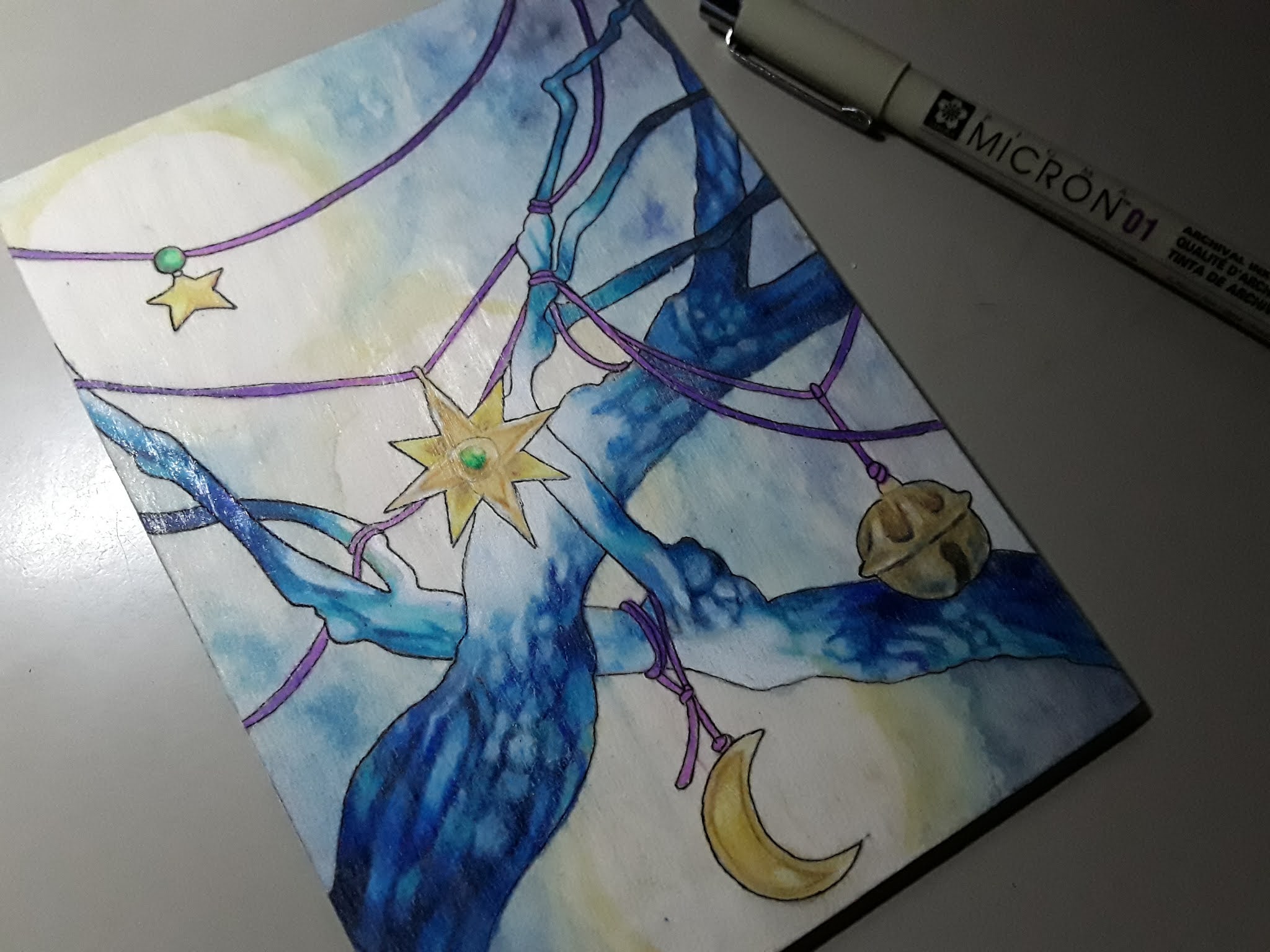
lid and internal panel. Once dried, I went ahead and lightly painted base colors as a guide to both pieces so that I had a better idea as to what I was doing before I brought forth the color pencils. With the internal panel, I was going to keep to the blues and purples with only little bits of yellow and green. So working gradually, I focused on the texture of the branches and finding myself discovering a narrative with it. I imagined that instead of the Red String of Fate, the strings that held up the various charms in the tree were purple. The stars, moons (and suns) would softly glow with their own light where as the bells would age but make sound. It was an interesting thought process to have as I slowly worked everything in.


Once the color pencil was in, I ended up painting another thin coat of transparent ground over it all and let it dry before I started to layer watercolors in order to help give an etheric glow to the charms. Since I was using the internal panel as a layout of how the lid was going to be, I set the internal panel aside to star working on the lid. Following the same process as before, however this time I wanted the center of the lid to be the same blue as the internal panel with the outside slowly fading to a somewhat more natural green and brown. Right away I could tell that the tree was going to give me troubles so I reminded myself to take it slow and give myself breaks. Once done with the color pencil part of it, I painted on another coat of the transparent ground and set it aside to dry before returning to the internal panel.


Using a 01 Micron pen (0.25mm), I carefully outlined the various elements of the internal panel. This took a bit of time, not just because of needing a steady hand but to also repeatedly clean the nib off and get the ink to flow how I wanted it. I'm loving how it is coming along so far but I can certainly tell that I want to have a little bit more dimension added to the panel before I go ahead and clear coat it. The lid, however, is showing me that much more work is needed

even as I get started on the watercolor I'm doing on top. So I'm plotting out what kind of details are going to be needed, what I need to do to tie both pieces in together (especially if they are to be hung together and not just as a single piece). With where I am right now with both parts, I'm estimating a few more days to get them to the point I want them but of course who knows.


Critiquing and Planning Ahead


Of course I know that there are going to be a good handful of you going "But Dawn! The internal panel is perfect! Seal it now!" Oh no no no, my eager art adventurers. There is much more that needs to be done first before either one can be sealed. The internal panel itself, though lovely, is lacking in depth and is just.. well.. flat. The charms need a bit more shading and the background itself is feeling more like an afterthought which is making the whole piece by itself to feel unfinished. Then there's the lid. Even at the point it is now, I can easily tell that it's no where near it's middle point. It needs more definition and shading where as the sun, moon and stars in the composition look like after thoughts. Yes, the center of the tree shares the same color scheme as the internal panel but that's it.  So there is still a lot more work to do on both to not only get them to where I want them but for them to compliment each other. It would be simply silly to have one look better then the other or for them to not go together at all. In the proceeding days, I will be working on the color, shading, detail and getting then to be as cohesive as possible before I start turning my attention to the extra elements and assembly. 

Tuesday, August 3, 2021

Celestial World Tree - Part 2


Welcome back to the next installment of this project. Let us jump right on in with this journey, shall we? Where we left off in Celestial World Tree - Part 1, I explained my thought process for what I wanted to do with the box, the brainstorming and rough design work for the project.


Cutting, Sanding, Glueing and Screwing

Sanded, Glued & Screwed
My wonderful father was certainly a huge help with this part since there was so many pieces that needed work. When I explained what I needed done, he was more then willing to lend his assistance. He was able to cut out the center logo of the lid while keeping the outlined circle intact then went ahead and followed my measurements for the interior panel and cut it out for me. I cut the back piece that was meant for the lid and made sure that the whole thing would be able to slide into position if the box was to be closed. Then onto the sanding! Going from a 220 to a 400, I made sure that various pieces were smooth. This also was the time I repeatedly test fitted the interior panel to see where I needed to sand a bit more for a better fit. The piece for the lid was glued into position and I waited overnight before doing another test fit. Luckily I had plenty of frame hooks at my disposal for the box and my father had tiny eye-hooks in his own stash of bits and bobs so that I could get those in place.


Working on Lines
Defining the Lines


Looking back at my rough sketches for the designs, there was a lot scribbles in spots that I knew I needed to rework before I transferred them to the wood. Grabbing another piece of paper, I measured out the sizes before using a light box to carefully trace the shapes. The design for the internal panel wasn't bad and only needed a couple of fixes. The lid, however, had a couple of elements that needed some reworking. Once done, taped transfer paper and the designs to their respective pieces and began the transferring process. Of course, once again the lid was being the problem child of this en-devour. I actually had to do the lid's design transfer in two parts – First had to cut the center of the design out and set it aside, transfer the outer design first then go back and do the center. There was probably a better way to do it but too late now.


Prep and Wait


Now that the transferring was done, I carefully looked over everything. Normally with my wood pieces I could go straight for coloring with my Prismacolor color pencils. However for the feel I wanted to go with, watercolors would be involved as well. Of course this meant that I needed to prep the wood first. So once I made sure my surfaces were clean and ready, painted on a layer of Transparent Watercolor Ground. With such things, make sure to wait the allotted 24 to 48 hours, depending on how thick or how many layers you've put on. Once I made sure that the surfaces were completely covered with as even a coat as possible, I set them aside to dry over night and contemplated my next batch of steps. At this point I will be keeping my fingers crossed that when I have in my head will be able to be made real. Guess we'll all find out in the next installment. Stay tuned! 

Sunday, August 1, 2021

Celestial World Tree - part 1

For those who have been following me on social media for some time may know that in between projects, I will go ahead and create altar boxes or mixed media art pieces from the various scrap wood/ wooden boxes I have. Well it's that time again but this time I will be taking you with me on this journey. So grab a beverage, some snacks and prepare for an interesting little trip through the process since I have no idea how many parts this is going to take.


Bits and pieces of the box
In the beginning, there was a box...

This particular box I've had in my stash for a number of years. It was the container for a particular brand of perfume and instead of a hinged lid like most boxes I acquire from salvage, this one actually slid into place. I knew I wanted to do something special with this but not sure what. The logo and information on the lid was branded in so any deep sanding would ruin the integrity of the wood since it was thin. Gessoing would not only loose the color of the wood but even through the process, there would be a faint indent of where the logo was. It took me some time of pondering (close to 2 months in the back of my mind while working on other things) to realize a simple solution to my problem – Just cut out the center logo. Well that certainly took care of that issue but now the next part of this insanity. The brainstorming and planning.


To the drawing board

Now that I have the center taken out of the lid, what was it that I wanted this box to be? I realized that I wanted to make this into a 2-part wall hanging art piece. The box itself with the lid in place could be one art piece but if the potential owner wanted to have the inside on display as well, the lid could be removed and hung as it's own art piece while the work inside the box could be displayed. Perhaps one of my more ambitious ideas for a project like this but

Rough draft concepts & brainstorming
I just couldn't stop myself. So away I went with roughly sketching out the concept designs along with brainstorming how I would need to trouble shoot some things. A lot of trial and error with a ton of erasing occurred just in the designs alone. Of course I will need to refine the designs before I work on transferring them to their respective positions but that's to be expected. The designs themselves may end up being mixed media with a combination of watercolor, ink and color pencil but I haven't quite fine tuned that thought process as of yet. 


Figuring out the pieces

So my first batch of things I needed to figure out while referencing my mad scribbling was how the design for the lid would work. I realized that I would need to secure a piece of wood on the back so the part of the design that was meant for the circle would be recessed. Luckily I had some thin pieces on hand that I could easily shape just larger then the hole for what I wanted to do. Covering up the bottom information would be a totally different endeavor which would include small paper floral leaves to cover it up. The design itself I would need to make sure didn't go all of the way to the edge so that the lid could still side in and out of the notches of the box without getting stuck or just not being able to be slid in. Hanging was the easier of the issues to sort out which was the use of a small eye-hook which would later be decorated and have a tassel from which it could be hung on the wall from.


The box itself was a little easier then the lid to sort out the mechanics with. A picture hook hanger on the back would allow it to hang from the wall without issue while another small eye-hook at the bottom would allow for some decorative tassel and charms to hang. The interior art work would be on a separate panel of thin wood/plywood which could be installed once it was time to get everything assembled. Of course there was going to be a lot of sanding in my future but hey, that's just how it is with this sort of thing. Now time to get started on getting all of these elements created and fitted. Stay tuned, folks!

Monday, April 12, 2021

Change of Plans

 They say that necessity is the mother of invention. Seems to be especially true when you're on a tight budget and trying to make use of a small space. Welcome back my fellow cleaning adventurers to another chapter of my reorganization mayhem. So if you've been following along up to this point, I've gone over the various containers that I've been able to get for some of my smaller supplies and told tales of my struggle to find a place for my larger pieces of equipment. This time around I shall lead you on a path of frustration of odd shaped supplies.


Childcraft Construction Paper Holder
Road of Obstacles
Acknowledging the fact that I needed a central space where I can store my various size pads of Bristol and watercolor paper so I could stop loosing them among other things, I started looking into possibilities. This is when I discovered that prices and sizes that fit my needs and budget was going to be a battle. Let me walk you through this - The pads I have that I would need to store together range between 9x12in (22.9x30.5cm) to 12x18in (30.5x45.7cm) which means I need something that would fit the largest size without issue but have room to accommodate the various smaller pads. I also am budgeting myself about $60 with a buffer
just in case it would cost up to $10 more for shipping and taxes. While looking through my options, I found several possibilities which would fit my size requirements however the prices were more then I was willing to stomach. One such discovery was this children's construction paper holder that had 29 3/8 x 12 ¾ x 15 inches as it's dimensions but a price tag of $151.21. There were several storage possibilities that were within my budget but the size accommodations would not work for my needs. Discussing my frustrations of this with my father, we agreed that my best option would be for us to look at wood and he would make an organizer for me that would satisfy both my needs and stay within my budget. The added benefit of this would be any leftover wood would be saved to be put to future projects.


Sauder 6-Cube Storage Cubby

Now the next hazard along this path was where the hell was I going to put the organizer once we were able to build it. Underneath my desk is completely out of the question since I already have various storage containers under it to. I also have no space in my bookcases which could accommodate it. So my only other option is my closet. Of course that means that I need to do a deep clean of the closet and see how much room I can make in order to have enough room for the organizer. That is where I am at right now. On the plus side, this is something that I've been needing to do for some time but now there's more of an urgency to it. One of the things that I've found that has helped are these small cube storage options. I was able to find the 6 cube option through Big Lots for only $29.99. Since I'm not concerned with color since they're going into a closet, I grabbed what ever color I could. Of course if I wanted to have them a different color, there was always the option of just spray painting them at a later time. Still have quite a bit more work to do but the small bits of progress has been rather encouraging.


So wish me luck, fellow DIY folks. In the meantime, if you're wishing to catch up on my cleaning odyssey then here you go: 

Part 1 - New Year, New Journey
Part 2 - Where do I put this?
Part 3 - Prepare the Tools