Friday, November 30, 2012

A Quest to see Stars


"Gift from Angel" by KAGAYA
Unlike some people who wish to go to Japan at some point in their lives to be surrounded by those who are a part of the Anime and Lolita/Cosplay community along with checking out popular sites, I've always wanted to check out 3 things: cultural centers (for my own research on local lore and symbolism), meet with the friends I've made thanks to the deviantART community, and a chance to see the works of the graphic fine artist Kagaya Yutaka (1968 -). For as long as I remember, I have always been a fan of Kagaya's work. Full of detail and grace, his mythology inspired pieces are always eye catching along with being able to tell an entire story without a single word. I believe that I had discovered his work back in high school and have always found inspiration in his beautiful pieces. I must confess that I have actually wanted to actually purchase a piece of jewelry that was inspired by one of his images but unfortunately his website only sells his products to customers in Japan. So while I keep the hope that I will be able to travel overseas at some point to actually get a chance to purchase something of his, I continue to visit his websites KAGAYAstudio.com and Aquarius-Stage.com (for minerals & accessories) to see what new pieces he has done or events he has been apart of. 


Last year or so I had discovered that he had created a show dealing with the star constellations with his art titled A Starry Tale. At first I was super excited at the possibility of seeing it then quickly became disheartened when at the time, the show was only being shown in various locations in Japan and maybe 2 or 3 other countries. The show itself, from what I can understand, tells the history of how the constellations came to be how we know them now and the mythology behind them. This visual story telling has music created by the Japanese New Age music group Himekami. Since I hadn't checked in sometime, I was curious to any updates that Kagaya had on his website. Wandering my way to listings of locations playing A Starry Tale, I was surprised to discover that not only the number of places had increased to include Greece, Ukraine, New Zealand, and 3 locations in the United States! I couldn't believe my eyes but indeed the US was finally presenting the show, with a 4th possible location in the future. One of the 3 locations however only showed this visual presentation earlier this year (March 2012). So for my fellow fans here in the US who may or may not have heard about the show, check out the following locations for more information to see show times and dates to make sure for yourself that the location is still playing it: 

Muller Planetarium - 210 Morrill Hall, University of Nebraska-Lincoln – Lincoln, Nebraska 68588

Texas A& M University-Commerse Planetarium - 2201 W Neal St. - Commerce, Texas 75428


For those of you who may not be familiar with the group Himekami, here is an example of one of their pieces. From their 1989 album titled Moon Water, this is the piece Earthflame.


Thursday, November 29, 2012

Destined for the Joint Forces


A couple of months ago, a friend of mine had been voted into organizing the Sacramento branch of The Friends and Family of the JFHQ-HHD (Joint Forces Headquarters). Talking things over with her, she was distressed over trying to figure out how to raise money for the group in order to help with little activities that help with families and friends of those in the service. It took both of us a bit of brainstorming different options when silly me blurted out 'art auction'. I'm not too sure what made me think it would even be a good idea but it was a surprise to me when she liked it and asked me if I could do something for it.

"(To Give) Flowers to Remember" by Dawn Star Wood
With my busy schedule, I never was able to get a chance to do any work on my donation. Days blend into months then earlier this week I realized that I needed to get something done before December 1 and panic ended up sinking in. It wasn't until Sunday night/Monday morning while I was starting to fall asleep when an idea finally struck me. So half asleep, I reached for my phone and wrote myself a series of notes of what my spark of inspiration gave me before it faded in my foggy mind. The next proceeding days was spent with me working on the small painting dedicated to remembering all of our veterans. Of course my scanner decided to make some of the colors a bit muddy looking or fading other sections making some of the details to be hard to see but in person, I'm really happy with how the painting came out considering I had to pull it off in about 3 days. 

Monday, November 26, 2012

Collaboration with Rebecca Tripp – part 8


Both Rebecca and I have been a little pre-occupied as of late but we've been keeping each other updated on things. She had let me know that she had been sick for a week but was returning to work on her videos then the following week, my internet decided to go out. Earlier this week I had excitedly let her know that my internet had been fixed so I was up and running again, which in response she let me know that she had a video ready for me to check out. 


Waltz of Peonies has to be Rebecca's softest, most relaxing piece yet. The use of the flute and piano was a gentle compliment to the harp she chose for this composition. Listening to it a couple of times, there was something about the piece that reminded me of something I've heard once before but I couldn't put my finger on it. Onward to a search! It took me some time but I realized that it had some similarities to the Debussy Sonate written by French composer Achille-ClaudeDebussy (1862-1918). 
"Enlightenment" by Dawn Star Wood

Looking through the wonderful art she chose for the video, my mind tried to go through all of the floral paintings that I had done. I thought for sure that she might have used His Grandmother's Flower which I had painted back in 2010 based off of a photo I took while with my boyfriend when we were visiting his grandparents in South Dakota. I was pleasantly surprised when I discovered that she instead chose Enlightenment (painted in 2011). I've always been rather fond of the piece which was my rendition of a plaque that had Quan Yin on it. You can actually see and purchase the original over at Sunlight of the Spirit Books & Gifts which is located at 2314 J street in Sacramento, California. 

If you would like to see more from Rebecca and give her a message, here's where you can find her work:
deviantART: 
 http://rebeccatripp.deviantart.com/ 
YouTube: 
http://www.youtube.com/user/RebeccaETripp

Tuesday, November 20, 2012

Made in America


Back in July I had mentioned in my post Entered into Magnum Opus XXIII Show that I had been accepted into the Sacramento Fine Arts Show for August with my entry Heritage (which you can see at the moment over at Blue Moon Gallery). At the time I was excited that I had received an email letting me know that I was accepted. What I hadn't mentioned in that post was that when I went to drop off my painting, each participating artist who was standing in line waiting their turn was asked if they wouldn't mind accepting a piece of gessoed hardboard to paint and bring it back in November for a benefits show. Each painting that would be sold would have the proceeds go to the art center. I figured why not and took one home to try out.

Mind you that it's a large span between the latter part of July and the November 20th drop off date for the piece which would make you think that there is enough time to go ahead and work on something that is only 5x7 inches (12.7x17.8 cm) in size but honestly I didn't get a chance to work on it until the day before the due date. Looking at this American made product in my hands, I couldn't help but wonder what I should do but I put my fears aside and told myself that it would be an experimental piece since I had never used Gessoed Hardboard before. The tag with the board states “A tempered, high-density panel coated with high quality artist gesso. Perfect for all forms of painting.” As a watercolorist, I wasn't sure how that would work with my medium of choice since I remembered how watercolors had a tendency of beading up on gessoed canvas and not stick.

"Abstract Dragon" by Dawn Star Wood
Doing a light pencil sketch on the material was relatively easy but the big test was trying to paint on it. At first, I thought that it was going alright but quickly realized that with my particular style of painting that I wasn't going to be able to layer as effectively as I would on watercolor paper. I also discovered that I couldn't blend very easily either. Then. It happened. There were a couple of spots on the board where the paints beaded up and refused to stick. It was even more frustrating when I had accidentally swiped my thumb over one of these spots and actually wiped off a section of paint. For a product that advertises that it's “perfect for all forms of painting”, I was finding it very unfriendly to a heavily water based medium. Since I couldn't do a wash on the rest of the board because of the beading affect, I just decided at that point that this was going to be a mixed media piece. Acrylics seem to work perfectly well on this product, leaving a relatively smooth layer on the surface. Gel pens also seem to work well (especially on top of the acrylic paint) but unlike being used on gessoed canvas or paper, the pens take a little longer to dry since they only have the paint that they're sitting on to cling to. If I had the time, I might have gone ahead and put some form of clear coat over the entire thing and let it dry overnight but since this was a last minute project, I give the suggestion to others. As an experimental material to use, the gessoed hardboard is fine but I really wouldn't pick it up for myself because there just seems to be too many flaws with it when it comes to using watercolors on it. 

Sunday, November 18, 2012

From fibers to metal


With the weather messing up my internet with the first rains of the season, I ventured over to one of my local coffee shops to use their slightly more stable internet in order to catch up on work and read up on things. I wandered my way over to the Smithsonian Magazine website to see if they had any updates in their Art/Culture section for this week and came across an interesting article. Titled Trash asTreasure: Crocheting Plastic Coral Reefs written by Megan Gambino (the same writer for the articles I mentioned in Tiny world through a big lens), the article brings to light the work of Sydney, Australian artist Helle Jorgensen. What is so fascinating about a person who crochets various types of coral? It's the fact all of her work is made out of colorful plastic bags that she picks up off of the beach and other locations in order to create these sculptures. It was interesting reading about how this Denmark native goes about gathering up her supplies and creating her intricate pieces which echos the beauty of the actual coral that they were based off of.

"Skull Kid High Detail Custom Doll" by SadDaysCrochet
Checking out examples of Jorgensen's work, I found myself remembering some of the more intricate crocheted pieces some of the artists on deviantART have done and posted. The fact that the materials that someone uses in crochet work doesn't have to be limited to a single material is always interesting. Deciding that I needed to go digging for some examples of impressive creations that these artisans. It's always enjoyable and awe inspiring to see what people have created out of various materials that cover from yarn to metal.

An artisan located in the United States, SadDaysCrochet's detailed creations are made out of yarn and embroidery thread. One great example of their attention to detail can be seen in Skull Kid High Detail Custom Doll (posted May 26th, 2012) where they made a doll based off of a character in Legend of Zelda: Majora's Mask.

"Mina bracelet" by Bodaszilvia

Originally known as SzilviaBead on deviant art, she is a jewelry creator focusing on wire work. Boda's work shows her plethora of inspirational sources such as Steampunk to Victorian. One piece that catches the viewer's attention is Mina bracelet (posted back on October 6th, 2009), you can see how much time it took her to tame the wire and have it become what she wanted. According to the description for this, she spent 30-35 hours to complete.

Wednesday, November 14, 2012

A common influence... maybe: Takashi Murakami


Ever so often I come across an art style that I really have no idea how describe it let alone know for certain what category I should put it in. This happens to be one of those times that I summon my bravery and venture into a relatively unknown style unless you're familiar with what I can only describe as Japanese Urban art. So who have I decided on for this interesting branch off from contemporary design? This time the artist in question is Takashi Murakami and his rather unique style of art.

"Mr. DOB and Me" by Takashi Murakami
Founder and president of Kaikai Kiki Co., Ltd., Takashi Murakami works in both in fine art media along with commercial media. The best way to describe his art is a marriage between fine art and Otako culture, mixing sculptures, paintings and Anime style figures together. Having attended Tokyo University of the Arts originally to become an animator, he actually majored in the traditional art of Japan. Eye-catching and colorful, his art follows his theory of Superflat which he describes as the blur of culture and society in post-war Japan.

I honestly wasn't sure when I went ahead and picked Mr. Murakami for this segment since though he's world known in certain circles, that didn't exactly mean that everyone would know who he is even if they had seen his work before. Personally I had seen a piece or two of his on the internet during my wanderings but never knew his name until I finally went looking for it so trying to find artists who had similar style of work was going to be interesting. Locating 5 artists, I went ahead and asked:

"With the colorful mix of images in your work, I was curious if artist Takashi Murakami was one of your sources of inspiration."

"Bobsmade Doodles" by Bobsmade
Popular among the deviantART community for the whimsical characters and combinations of elements, Bobsmade's gallery often shows what they had done for customers (from custom painted shoes and headphones to tshirts and posters). Graphically striking, there are some Anime elements to each piece. It is always entertaining to see what new piece they have up. You can actually visit www.bobsmade.com if you're interested in seeing all of the products they have available and place orders.

"I don't know him. I get the inspiration from my customers" ~Bobsmade

"Midnight Noodles" by bogielicious
An anonymous graphic artist from Indonesia, Bogie's pieces brings urban art to a mainstream audience. Active imagery and bright colors are rather striking and causes the viewer to be pulled in and want to look at all of the details he's put in. For those who want to find out more about some of the things he's done or just read his thoughts, he does have a blog you can check out which is bogielicious.blogspot.com.

"Wow, I've never heard him before, lol
But thanks for inspiring artist " ~bogielicious 

Due to their schedules and things that I may not know about, only 2 of my choice of 5 artists have been able to respond. Like always, once the others respond then I will be adding their comments as well to my question. In the meantime, have a look at their work and see if you can see if they were influenced by Takashi Murakami or not.
"Under My Bed" by recycledwax

A graphic artist located in Canada, Wax's style is a little bit cartoony mixed with his unique sense of humor and personality. Each colorful piece is interesting to look at and brings a smile to the viewer's face. He uses his twist on things to re-imagine well known characters such as Waldo from Where's Waldo along with creating new creatures from his own imagination. You can also follow him on his tumblr account at recycledwax.tumblr.com .
"Suburban Invasion" by tokyo-go-go


Focusing on graphic design, Greg's heavily vectored work seems to show a mix of mainstream gamer/movie culture and his own creature creations. Doing illustrations for both clients and himself, each piece is detailed and captures the viewer's attention.


"M from Mushroom Fake Star" by muloyoung

A graphic artist and illustrator out of Indonesia, Mulo Young has an interesting flare to the work he has on display. Having several staple characters, they seem to be his avatar and original creatures in a world that only Mulo has access to. You can check out more of his work on his blog muloyoung.blogspot.com.


Sunday, November 11, 2012

It started with bookmarks...


I have been having an interesting little journey through art and culture as of late so I thought that I would go ahead and share. It started off with the idea of wanting to do a set of Holiday themed bookmarks where each one represented a major religion. One of them was to be based off of an upcoming Islamic holiday but as someone who is not Muslim, of course I had no idea what I was doing. Originally I thought I could do something that represented Ashura until I did some reading and discovered that for the Shi'a Muslim community, Ashura is actually a day of mourning where as with the Sunni Muslim community it's a time of fasting. Since my aim was to do bookmarks that would was a celebration of life and not something sad or rigid, I decided that the Islamic New Year would be a better choice for the theme I'm aiming for.

After this little adventure, I wasn't prepared for what happened next. It seems that someone has been playing with the strings of my life trying to give me more information to work with or at least sparking my interest in doing more research into a culture I'm not fully familiar with. I had wandered my way to the Smithsonian Institute's website to check out what exhibits they are planning on having in a couple of month and stumbled my way to Smithsonian's Museums of Asian Art. While scrolling through, my eyes caught sight of Roads of Arabia: Archaeology and History of the Kingdom of SaudiaArabia. What was the chances that I spot something like this right while I've been trying to do research? I was completely blown away and found myself wanting to share for those who are interested in the art and history of Saudia Arabia. The exhibit is set to be on display from November 17th, 2012 to February 24th, 2013 over at the Smithsonian Institute located in Washington, DC (1050 Independence Ave. SW   Washington, DC 20560). 

When it comes to one thing leading to another, this tale hasn't seemed to have an end as of yet.  As soon as I traveled through what the Smithsonian had, my mind quickly was thinking of art on this matter. For those who know me best may be familiar with the fact that I enjoy the art from other cultures, especially Asian and Middle Eastern. When it comes to Middle Eastern work, yes the intricate geometrical patterns are impressive but I have to say that the most beautiful thing to me is their writing. The elegance of the script and how elaborate just the display can be has always been a feast for my senses for some reason. Mind you I have no idea what they say but that doesn't take anything away to me. With this little project that I have going on for myself has made me wander through the galleries of some artists on deviantART to help with inspiration. I thought that I would go ahead and share some examples of what I mean when attempting to explain the beauty of Middle Eastern script.

"Zaynab's 'alaihi salaam" by montaserart
An anonymous graphic designer out of Iran, I stumbled across montaserart's account oddly enough when I was looking for some examples of illuminated text (which makes sense when you think about it but at the time I was looking for European style). Each of his works, though seeming relatively simple at first, show a great amount of attention to detail to emphasize the word or statement he wants to present to the viewer without the entire piece being completely overwhelming with a mass of textures. Among the pieces, Zaynab's 'alaihi salaam caught my attention the most. In the description, he adds the simple text:
Zaynab's 'alaihi salaam
دل اگر هست دل زینب کبری باشد ... افرین باد بر این همت مردانه دل
(Translation: If there is a heart to heart Zainab Kubra ... Blessed be the man by Heart)


"--In the name of God--" by KhalilNam

Working in traditional, mixed media and graphic design, this young man has an interesting sense of design when it comes to presenting his script. As he explains in the description for –In the name of God-- that the text translates to “In the name of God, Most Gracious, Most Merciful” and is in the style of Tughra script. He also sites that the background is thanks to another artist by the name of Khalid Shahin


"Arabic Calligraphy II" by zArtandDesign
A young woman out of Norway, Z's gallery is something that didn't hit my radar until she had been chosen as one of the featured artists for deviantART back in March 12th, 2010. A happy graphic artist, her unique style shows of her perky personality and is always fun to check out. Her colorful piece Arabic Calligraphy II has the beautiful script which translates to “and he 'Allah' is the one who is capable of everything”.


Saturday, November 10, 2012

Collaboration with Rebecca Tripp – part 7


Having a chat with Rebecca about her work is always an adventure because even through the computer screen, I can get a sense of her giddy excitement and passion for what she does. The other day she had hyperly let me know that she had gone ahead and posted a new video and sent me the link, thanking me again for letting her run through my gallery. When she told me that the video this time around was themed with Trillium and Bleeding Hearts, I was curious as to which of my paintings she had decided to use since I have several where I have Bleeding Heart flowers in them. Unfortunately, at the time, the link she sent me wasn't working so I had to go ahead and send her a message letting her know. I was glad when she sent me a response letting me know that she was able to get it up and running.


"I'll be your..." by Dawn Star Wood

Waltz of Bleeding Heart is quite different from the other pieces she's done with my work included. This particular one had very much a Baroque feel to it. Perhaps a slightly similar comparison would be some of Giovanni Gabrieli's (1554-1612) work such as Canzo septimi toni or Toccata Settima by Michelangelo Rossi (1601-1656). Mind you, these two men have very different styles and I'm not saying that Rebecca's piece is exactly the same but there are tiny elements within her music that brings to mind different things I've listened to over the years. Hers, is of course, much gentler then Michelangelo's harpsichord pieces and not as brassy as Giovanni's since she has more strings but the mix of elements is there. There are also perhaps several other composers that would work in this mix but within the Baroque period itself, there were too many composers to count and all had beautiful work in their own right. 

It took me a moment for me to find my painting in my own gallery once I spotted it in the video but was finally able to locate it as being a small 4x6 inch watercolor I had done back in 2008 that I had titled I'll be your... . I had created it around Valentine's Day of that year and had dedicated it to all of my friends, family and viewers who couldn't be with the one they cared about the most due to various reasons. The painting was based off of a lovely photo titled Bleeding Heart Jewel by UffdaGreg.deviantart.com (United States).  

Friday, November 9, 2012

Coffee Review: Entenmann's Hazelnut Ground Coffee


While wandering various grocery stores and markets, I tend to wander my way over to the section for coffee and tea to see what they had available. Depending on the store, they really don't change what they have available but ever so often I spot something I haven't seen before. Today was such a day. Wandering through my local Grocery Outlet (same spot mentioned in Coffee Review: Eight O'clock ground coffee), I came across a 10oz (283g) bag of Entenmann's Hazelnut Ground Coffee for $3.99. At the time I wasn't too sure if I should pick it up but for the price, I thought it would be a good chance to try something new for this segment.

Though it is resealable, that really doesn't help when the stately white package is difficult to open. Struggling with it a bit, I accidentally tore a hole near the top of the bag. It's not the first time I've had this happen to me when opening up one of the bags I've tried out but it's still annoying as all hell when if does happen. Deciding that it would be a good idea to use scissors where the hole formed instead of attempting to rip it more and end up with coffee across my desk and keyboard, I was able to make sure that I could have it open enough to get the coffee grounds out but still reseal it. I was however rewarded by the slightly sweet and nutty aroma of the Hazelnut coffee, taking note of the chocolate undertones. Once the medium roast coffee was brewed, I noticed that the aroma actually mellowed out. The sweetness that I noticed when the aroma was emanating out of the bag seemed much more of a sultry quality. The flavor itself is mellow as well with of course the slight nuttiness you would expect from something that has a bit of Hazelnut in it. Something that I don't often bring up is the aftertaste. With this, there really isn't anything strong left in the back of your pallet but the almost chocolate tones of the Hazelnut dance for a bit on the tastebuds for a moment or two.

Entenmann's is a brand created by the White Coffee company which makes both coffees and teas. The other flavors that the Entenmann's brand offers is Vanilla, Cinnamon, and Chocolate Donut. They do have a section where you can order their various products (such as Kahlua Coffee) online but due to the fact that they are still adding more things to their online shopping section, unfortunately the line of Entenmann's flavored coffees are not available. I suggest that the best way to find this particular one would be checking your favorite grocery store and see if they carry it. 

Tuesday, November 6, 2012

Tiny world through a big lens


It has been some time since I've taken a look at the current articles in the Art/Culture section of the Smithsonian Magazine website so that I would go ahead and check it out so see what news has happened recently. One of the articles from October 29th caught my attention mainly because I have several photography friends who might be interested. The article, titled Nikon announces the Winners of its“Small World” Competition (written and posted originally by Megan Gambino who's most recent posting was Beetles Invasion: One Artist'sTake on the Insect which is also an interesting read), gives the reader a small overview of the Photomicrography competition and shows the amazing photos which was chosen as the winners. For those out there who are not familiar with the term of Photomicrography, it is commonly refered to as micro photography which is an image which shows the viewer a super zoomed in look of a subject matter. In the the realm of fine art, micro paintings are actually in reference to miniature pieces of work that often need a magnifying glass or microscope to view it but let me not get ahead of myself. Some of the winners that were listed were Walter Piorkowski, Dylan Burnette, Michael John Bridge, Geir Drange, Alvaro Migotto, Diana Lipscomb, José R. Almodóvar Rivera, Charles Krebs, David Maitland, Somayeh Naghiloo, and Dorit Hockman. 

"When Seasons Meet" by Sandy515
Thinking of some of the photographers on deviantART who have some beautiful examples of close up view captures, I found myself looking through some of the photos I have in my favorites folder that I wanted to share. It was pretty difficult to narrow it down to just a couple so not to just spam pictures all over. I finally narrowed it down to 3 examples of work that the judges of the Photomicrography competition could have been going through when looking at the over 2,000 submissions that came in from around the world. 

A photographer from Russia, Irene's work focuses mostly on natural elements (flowers, leaves, etc.). Having a soft, gentle feel to each one, I decided to pick a photo she captured in Janurary 2009, in which Irene states in the description of the photo:

Dandelion seed with a snowflake. I had this idea for a long time, but the weather let me make it only today. It's my first real winter shot. And also this is for the Seasons contest by InLightImagery.deviantart.com 
Here're two seasons together. I think it's very scarcely that such a meeting could happen without my little help. 

"Red Veined Darter II" by struller


Focusing on nature, be it from landscapes to small animals and insects, this gallery is a joy to visit. Surprisingly taken back in November 2007, Martin Amm's photo of a due covered dragonfly is always fascinating to look at. His simple commentary in the description is:

Taken before sunrise, when the dew covers everything.
d200 - bellow - enlarging lens


Dark-Raptor is actually the combined works of 2 different people, D. Kucharski and K. Kucharska. They are both biologists, focusing on entomology, arachnology, parasitology and ecology. Both have some beautiful work but this particular piece (captured in January 2010) is one of the wonderful examples of extreme close-up. Stated in the description:

Extreme close-up of scales on a swallowtail's (Papilio machaon) wing.
Nikon D200, two sets of extension tubes, reversed Takumar 28/2.


Sunday, November 4, 2012

Collaboration with Rebecca Tripp – Part 6


Hot on the heels of Collaboration with Rebecca Tripp – part 5, she literally just sent me the video's link as soon as she posted it. I couldn't help but stare in disbelief at her post, completely amazed that she had been able to finish both videos so close to each other.


"Irish Tranquility" by Dawn Star Wood

Bluebells Waltzing has a much more spring like feel to it, reminiscent of watching the fields of wildflowers in Europe begin their blooming as the last of the snow melts. What amuses me of the piece itself is that somewhere in the beginning of the piece, there is a tiny high pitched 'ting' which seems completely out of place. I'm not quite sure if it was deliberate or a mistake but it brings back memories of watching Disney's Fantasia and Fantasia 2000 where the animators always seemed to put in an element of something falling out of place or a person stumbling before the rest of the piece was done without a hitch. The rest of the piece is beautifully done and filled with equally lovely pieces of art. 

I couldn't help but giggle when I saw the piece she had decided to choose of mine. Rebecca had decided on Irish Tranquility which I had painted earlier this year for Blue Moon Gallery for St. Patrick's Day. I was trying to pull together native wild flowers of Ireland but because of how my scanner was at the time, it ended up darkening most of the painting causing me to loose a lot of the subtle shading I had done in this 11x14 inch watercolor. 

Collaboration with Rebecca Tripp – Part 5


Since the beginning of our little collaborative relationship online of composer and artist, Rebecca and I had discussed how she wanted to share the works of many different artists with her music. Of course we had both noted that such a lengthy endeavor would take a lot of patience, especially when she points out to me that in some cases it had taken her nearly a year just to get responses back from people she had sent inquiries to for permission to use their work. One such case was the musical number she just sent me a link to with the following comment:


Nearly 7 months for one video? Dear Lord. Along with the fact that she is barely to the halfway point for her project of pairing artwork with her music just makes my mind race. To think that my own projects and research takes a week to nearly a month or so puts things into prospective for me the amount of work she has been putting into each of her videos. 


"Celtic Horse" by Dawn Star Wood

Nearly 7 months for one video? Dear Lord. Along with the fact that she is barely to the halfway point for her project of pairing artwork with her music just makes my mind race. To think that my own projects and research takes a week to nearly a month or so puts things into prospective for me the amount of work she has been putting into each of her videos.

With the harmony of strings, keys, and woodwinds, so many images flow through your mind. The Ivy Waltz actually has a lot of Renaissance quality to it, as if it was something that you may perhaps hear if you were attending court at a palace during the time or strolling along flower kissed paths of a lush garden. The work Rebecca chose to go along with this musical piece works perfectly with the gentleness of the piece. The piece that she chose of mine was a 10x20 inch watercolor painting I had done back in 2009 that was titled Celtic Horse. What I was trying at the time was making it look as if it was just a section of wall. Even though my style has changed a bit since then, this is perhaps still one of my favorite pieces. 


If you would like to see more from Rebecca and give her a message, here's where you can find her work:
deviantART: 
 http://rebeccatripp.deviantart.com/ 
YouTube: 
http://www.youtube.com/user/RebeccaETripp

A common Influence... maybe: Robert Edmond Jones


Lately it has been difficult to come up with an artist that I would like to bring to light that I could find who has influenced other people. I actually have been cruzing the internet along with my wide range of reference books here in my mini library located in my office/studio space. Knowing that I was going out on a limb when I finally settled on someone, I felt that I really had nothing to loose since there was basically a 50/50 chance that someone might know him. So I settled on costume designer Robert Edmond Jones as my focus this time around.
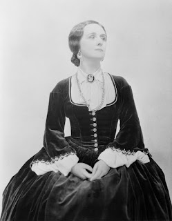
Costume design by Robert Edmond Jones
For anyone familiar with American theater on Broadway during the 1920s-1940s probably would know the names of such productions as TheGreen Pastures (1930) and The Iceman Cometh (1946) but may not know that Robert Edmond Jones (1887-1954) was responsible for these. Though he attended Harvard University, he had done some studying abroad in Berlin, Germany with Deutsches Theater. Couple with several successful Broadway productions, Mr. Jones was also the production designer for some early Technicolor files like Becky Sharp (1935). It was thanks to his insight of mixing together his unique design elements with the storytelling so they worked as one cohesive unit instead of separate entities as they had been up to that point in the American drama scene.

It was difficult to tell as I went through gallery upon gallery of various costume and clothing designers if any of them were influenced by Mr. Jones or even had learned of him. It was perhaps the fact that I chose such an obscure individual who barely had much written about him. Maybe it was because his style fit so well with the time periods of each story he helped tell. All I can say is that when it came to figuring out what my next step would be, it was a large challenge. After a good 2 days of debating what I should do, I finally picked 5 designers and asked my question:

"With so many wonderful creations, I was curious if costume designer Robert
Edmond Jones was at any point your inspiration among your other sources
of ideas."

Moon (details) by lions-nd-yellocake
American traditional artist who focuses on mixed media pieces, Jennifer Weiler also does costume designs. Her unique pieces seem to be a beautiful marriage of not only various time periods but also of cultures which gives each garment a whimsical, almost fantastical feel to them.

"Thank you! Actually, I've never heard of Robert so now I'm curious as to who he is haha. Going to go Google him right now. Paul MurrayFrancis Bacon, and Alphonse Mucha are the artists I've been inspired by in the course of work. (:" ~Jennifer Weiler

Janey-jane.deviantart.com (United States)
Bias cut wedding gown by Janey-jane
A traditional media artist located in the US, Janey-jane focuses a lot of her work on fan-art genres but does her own flare towards fantasy. Even with this, she does do some costuming which ranges from Italian Renaissance to cosplay. Her attention to detail which is constantly shown in her drawings and paintings really come to life when put towards fabric. Much like Jennifer's response to my question, I really wasn't surprised when she revealed that she didn't know who Mr. Jones was.

"I had to google him so I have to admit that he wasn't, but I've been influenced by TONS of different artists, designers, graphic movements, etc. etc. I love pulling bits and pieces of influence from a bunch of different sources." ~Janey-jane


Victorian Plum Gown by Picklethis

Picklethis.deviantart.com (United States)
Founder and head designer of Pickle This! Clothing, Pickles Morgan's style is an interesting mesh of Steampunk and Gothic. Her gallery on dA displays the various creations she has done up to this point but of course also calls attention to her busy schedule. From the runway to Steampunk events, her work shows the time and commitment to quality. 
Etsy shop: http://www.etsy.com/shop/PickleThisDesigns#
(where you can send her messages inquiring about custom costumes) 

"Actually I have never heard of him but I looked him up and he is very talented. "


Unfortunately, this time around I only had the three responses thus far. This is perhaps due to the fact that those who I contacted have been extremely busy with private orders, school, work and just life in general. Of course as soon as I do receive word from the other artists, I will add their comments to this. In the meantime I would like to share the work of the other 2 artists so that you, the reader, can guess on their inspirational source.
Fabric Scribble by noodle-cup

An anonymous designer from Italy, Noodle-cup has several pieces in her collection which has a Victorian almost Steampunk feel to them. Though nearly all are in shades of black, blue and grey, her work is very reminiscent of stately women strolling along grand halls softly chatting among themselves behind lace fans.


Spring Fay by Lillyxandra

Perhaps a bit more well known within the deviantART community for her fantasy inspired pieces and accessories, JoEllen Elam's beautiful fairy costumes and amazing gowns are always a delight to see. Each piece has her full attention and doesn't skimp on the tiny details, giving the viewer something new to discover every time they look at the piece.